Leader. Builder. Designer. Storyteller

turning ideas into

Play Video

Services

Lean/Agile Team Building
Building modern agile teams, systems, and culture that support fast-moving, adaptive product lifecycles.
Product Strategy
Defining vision, goals, and roadmap to align product direction with business impact.
Product Design
Designing user-first interfaces and intuitive experiences across platforms.
Product Development
Translating ideas into scalable, performant digital products with real-world usability.
Brand Strategy
Shaping how your brand communicates, positions, and connects with its audience.
Brand Development
Building the visual and verbal identity that makes your brand recognizable and consistent.
Content Strategy
Planning what to say, how to say it, and where to say it — to drive clarity and impact.
Content Development
Bringing stories to life through writing, video, imagery, and multimedia creation.
Rich Wilson
Chief Product Officer / VP Product Design

Products that elevate

Design that inspires

Stories that connect

I’m a Chief Product Officer/VP Product Design, certified UX/UI designer, and filmmaker with a passion for creating human-centered experiences that inspire, connect, and delight.
Download CV
Because of Rich’s massive creative skills, experience, and work ethic we have grown, scaled, and become more recognized than ever.
Gina Manis-Anderson
VP, Solutions & Growth - Geodis
You will always be a great part of our story and no one has ever told it better than YOU!!
Mark Johnson
Co-Founder - Playing for Change
Rich's commitment to delivering high-quality, user-centric products has been a key driver of our success.
Eric Kasper
CEO - 1 Commerce
Rich quietly built a strong brand that gave us instant credibility in the marketplace and helped with our product design in a way that made it not only more user-friendly, but also a delight to use.
Mahesh Sriyapu Reddy
Founder/CEO - Fiberify, Inc.
Rich’s guidance about clearly understanding my audience, identifying transition opportunities, and founding a startup have been invaluable.
Nicole Forsgren
Partner / Research & Strategy - Microsoft
Rich is one of the most creative people I have ever worked with in my long career.
Bill Jennings
GM - Jefferson Pilot Communications
Rich Wilson
Chief Product Officer
Product Strategy, Design, and Development
Brand Design & Development
Motion Design & Production
Product Strategy, Design, and Development
Brand Design & Development
Motion Design & Production
Product Strategy, Design, and Development
Brand Design & Development
Motion Design & Production
Product Strategy, Design, and Development

Works

Product Design
Product Strategy
Branding
One Commerce is a unified commerce management platform that empowers brands to sell anywhere and ship everywhere — all from one streamlined ecosystem.
Product Design
Branding
Fiberify is a platform that empowers telecom operators and their suppliers to manage the cost and complexity of building, operating, and maintaining network infrastructure.
Branding Strategy
Branding
Bodhtree Solutions is a tier two consulting company focussed on delivering outsourced applications and analytics solutions for large enterprise brands.
Branded Short Films
Behind The Song – “The Weight, Part One”
Behind the Song - The Weight – Part One captures a deeper look at how Playing for Change re-imagined this classic song with legend Robbie Roberts
Product Design
Product Strategy
PrintStator is a next-generation motor design platform that enables engineers to search, customize, and create electric motors using advanced PCB stator technology — all within a secure cloud-based environment.
Product Design
Product Strategy
SL2Z - Anti-phishing Google Extension
Highwater is a cinematic surf documentary produced for Image/MGM, capturing the intensity and beauty of the Vans Triple Crown of Surfing. With full production
Feature Films
Dust to Glory
A follow up project right on the heels of Step Into Liquid, Dust to Glory was an adventure unlike anything I’ve ever been a part of. As executive producer, I helped finance...
Feature Films
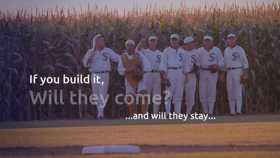
Step Into Liquid – Lion’s Gate Release
Step Into Liquid is a beautiful genre-breaking documentary that found a theatrical audience worldwide, won many awards and paved the way for entry to filmmaking
Product Design
Product Strategy
ROYAL CARIBBEAN
Working with the Royal Caribbean team on a software platform called, Excalibur, we designed and developed a custom integration between ServiceNow and Slack...
Feature Films
Highwater - Image Entertainment Release
Highwater is a cinematic surf documentary capturing the intensity and beauty of the Vans Triple Crown of Surfing on the North Shore of Oahu.
Product Design
Branded Short Films
Peace Through Music
Peace Through Music is one of a kind collaboration with Playing for Change, The United Nations, and Facebook (among others) celebration the 75th Anniversary and the UN's global initiative for Social Justice
Product Strategy
Members Portal – User Research
To improve membership value and retention, I led a comprehensive user research and UX redsign initiative for Playing For Change that all began with measurable insights
Branded Short Films
Behind The Song – The Weight, Part two
The Weight Behind the Scenes part two was needed to properly tell the full story of this amazing body of work with such an epic lineup of performances
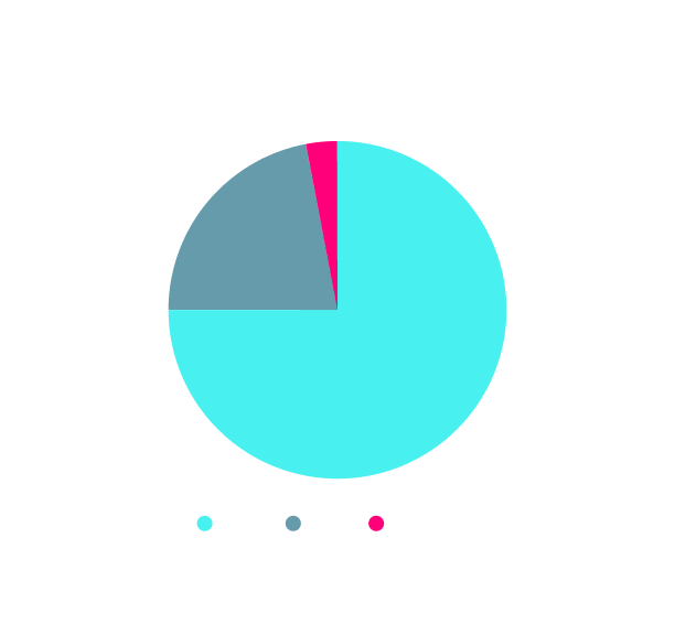
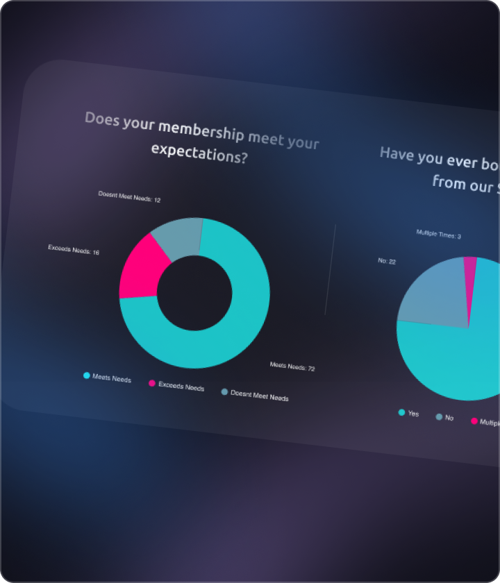
Branding
TOURtech is the market leader in providing temporary event WiFi, festival WiFi, VoIP, Internet Connection Management, and Mobile Office Solutions.
Branding Strategy
Branding
VeepStack Collective is a digital marketing agency that designs applications, content, and websites, and produces digital media and motion design of all kinds..
Let’s build something bold together.
Have a project in mind or need a powerful digital presence? I’d love to help.
Product Design
Product Strategy
Branding
VeepStack Collective is a digital marketing agency that designs applications, content, and websites, and produces digital media and motion design of all kinds. .
Rationale: The company was originally concieved as a CXO an on-demand service for SMB and mid-market, so the iconography convey experience across layrs of diverse industries.
Custome Font
A heavy futureistic custom font was created to give the mark an upward movement for the word Stack
Monteserrat
Medium weight font that again is uncomplicated and clean yet elegant and modern

From search to design approval, every step supports performance, precision, and scale.

Feature Films
Branded Short Films

Highwater

Highwater is a cinematic surf documentary produced for Image/MGM, capturing the intensity and beauty of the Vans Triple Crown of Surfing. With full production ownership — from direction to distribution — the film brought powerful storytelling and raw athleticism to screens across the world.
Designed for theatrical release, Highwater required a brand identity and media campaign that could resonate globally, reflecting both the scale of the waves and the emotion behind the ride.
Play Video

The impact was as powerful as the waves themselves.

From the energy of the ocean to the emotion behind each frame, Highwater captured a story that resonated on screens around the world — delivering more than a film, but a feeling.
Product Design
Product Strategy
Branding
As a pre-revenue startup, ONECommerce set out to become a unified commerce management platform that empowers brands to sell anywhere and ship everywhere — all from one streamlined ecosystem. The brand identity and message needed to be inspiring while also trustworthy.
Rationale: The 1 Commerce value proposition was to do all things commerce from a single app, including logistics (fulfillment, shipping, returns). The inspiration for the mark came with a double meaning - from one perspective, it looks like a hub and spoke, from another perspective it looks like a box. Both interpretations integrate the number value of 1 in a notification pattern which is intended to infer any number of counts in the e-commerce supply chain )orders, shipments, items in cart, etc.)

Target Audience

We identified and analyzed the core users of One Commerce to ensure the brand speaks directly to their needs, pain points, and aspirations. Understanding who we're designing for allowed us to craft a brand experience that feels both relevant and empowering.
Primary Segments:
  • Medium and Large-sized brand owners seeking operational control of their entire e-commerce supply chain.
  • Operations and fulfillment managers needing visibility, control, and centralization.
  • Brand owners, Entrepreneurs and founders who want to grow revenue with automation minus all the complexity.
Core Needs:
  • An intuitive, all-in-one platform
  • Transparent control over products, logistics, inventory, and orders
  • Simple onboarding and scalability — no developer required
  • Comprehensive transactional data access, visibility, and inisghts
BRAND EXPRESSION

Visual Language: Type & Color

We identified and analyzed the core users of One Commerce to ensure the brand speaks directly to their needs, pain points, and aspirations. Understanding who we're designing for allowed us to craft a brand experience that feels both relevant and empowering.
Typography Strategy
We combined Indivisible BLK for its bold, trustworthy presence in headlines and logotypes, with Aktiv Grotesk for its modern clarity in body text and UI labels. Together, they create a typographic system that balances impact with readability — ideal for a product that aims to be both powerful and intuitive.
Indivisible (Blk)
A heavy classic font was used to give the mark a confident, trustworthy, and bold weight and feel.
aktiv grotesk
Medium weight font that again is uncomplicated and clean yet elegant and modern
Color System
The color palette was designed to feel energetic and future-forward, while maintaining clarity and contrast across all digital surfaces. Magenta adds a sense of boldness and identity, Midnight brings depth and focus, and Charcoal grounds the visuals with a clean, neutral base. Together, they create a system that’s both striking and functional — perfect for a product-first tech brand.
Website Overview
The ONECommerce website serves as the first real-world application of the new brand system — combining bold design with a clear product narrative. It introduces the platform’s value, builds trust through consistent messaging, and drives users to get started with intuitive navigation and a sharp visual hierarchy.
Product Design
Product Strategy
Branding
As a growing telecom platform, Fiberify needed a brand identity that felt both modern and credible — something that could clearly communicate its promise of verified connectivity and real-time infrastructure monitoring. The design had to reflect innovation, while maintaining simplicity and trust.
Logo Development
To create a brand that truly resonates with the telecom industry, we began by defining what Fiberify stands for: speed, clarity, and trust. The name itself — a fusion of “fiber” and “verify” — guided the entire visual identity.

The checkmark in the logo communicates verification, accuracy, and service reliability, while its angular structure evokes fiber networks and infrastructure. We explored multiple visual directions, ultimately landing on a mark that feels both engineered and approachable — reflecting Fiberify’s role as a modern, intelligent platform for telecom service providers.
Visual Identity

Visual Language: Type & Color

The visual identity for Fiberify was crafted to reflect the platform’s intelligent, tech-forward positioning. We selected a bold custom typeface that projects precision and modernity, paired with a vibrant palette anchored in orange and green — representing energy, innovation, and trust.

The combination of sharp lines and clean geometry communicates both clarity and authority, while the bright, optimistic tones signal reliability and ease of use — helping the brand stand out in the telecom space.
Typography Strategy
We selected a futuristic custom typeface to convey Fiberify’s focus on innovation and technology, particularly for logotypes and hero messaging. For supporting text, we used Helvetica Neue — a clean, modern sans-serif that ensures legibility across interfaces. This pairing delivers a balanced system that feels both advanced and accessible — supporting the brand’s promise of smart, scalable service.
Custome Font
A futuristic custom font was designed to create with modern computer technology brand image
Helvetica Neue
Medium weight font that again is uncomplicated and clean yet elegant and modern
Color System
The Fiberify palette uses vibrant orange to convey urgency, energy, and innovation — core traits of a responsive telecom brand. A bold green checkmark reinforces the idea of reliability and verified performance, while neutral grays support a clean, modern aesthetic. This combination ensures high contrast, strong readability, and a confident, high-tech feel across all brand touchpoints.
Messaging
To ensure a consistent and confident brand voice, we crafted messaging that communicates Fiberify’s promise:
“Verified Fiber Field Intelligence.”
The tone is direct, technical, and trustworthy — designed to resonate with telecom professionals who value performance, reliability, and speed. Key phrases are reused across touchpoints to reinforce brand positioning and support quick recognition.
Product Marketing Collateral
To bring the Fiberify brand to life across marketing touchpoints, we developed a cohesive set of product marketing assets. Each item reflects the brand’s sharp, modern visual identity while reinforcing key messaging pillars.
Sales Enablement Materials
Polished pitch decks, datasheets, and overview pages for clear, effective enterprise communication.
Platform Feature Guides
Visual collateral explaining platform modules and functionality for use across web, email, and presentations.
Website
Design and development of fully responsive website with tracking, data collection, and social integrations
Product One-Pagers
Focused summaries of Fiberify modules — from Field Agent Management to System Integrations — designed for easy sharing and fast comprehension.
Awarded Trademark
Following the successful development and launch of the brand, Fiberify™ was officially recognized and awarded a registered trademark.

This milestone not only validated the uniqueness and strength of the brand identity, but also protected the logo, name, and messaging across all markets. Securing the trademark solidified Fiberify’s place as a credible and differentiated player in the telecom infrastructure space — and ensured long-term consistency across global touchpoints.
Feature Films
Branded Short Films

Members Portal – User Research

To improve membership value and retention, we led a comprehensive user research initiative for Playing For Change. Over 1,200 members participated, providing key insights that shaped product improvements, clarified platform priorities, and highlighted motivations for joining. The resulting data informed strategic decisions across content, commerce, and community features.
Does your membership meet your expectations?
Have you ever bought anything from our Shop?
What motivated you to become a member?
1,200 +
Respondants
Multiple Choice + Open Type
2 Questionaires
24 Questions
1 Week to Insights

Key Insights

Philanthropic aspect of the brand is a key driver of paid membership
Lack of merchandise awareness impacted e-commerce volume
Platform discoverability (FB, YT, Google Ads, Web) impacted conversion
Modern features were a limiting factor in NPS scores