
.png)
.png)
.png)
.png)
TourTech required a brand identity that delivered on it's unique promise
TOURtech didn’t just need a new logo — it needed a voice. A brand that speaks to speed, innovation, and seamless connectivity. The solution required strategic thinking and bold design to stand out in the fast-paced world of event technology.
The Challenge
No clear visual identity or starting point
A crowded market with long-established competitors
Transitioning from a service provider to a recognizable brand
No existing brand assets or collateral
Lack of internal understanding of branding as a value driver
The Goals
Build a cohesive brand system that can scale with the business
Blend technology with human-centered symbolism in the identity
Design a logo, type system, and color palette that feel modern, trustworthy, and instantly recognizable
Develop a website with clear UX, intuitive structure, and seamless navigation
Communicate innovation and energy while maintaining professionalism
+240%
Boosted overall revenue by over 240% within 18 months through strategic brand positioning
+45%
Increased conversion rate from event support inquiries to full-service tech deployments
+7
Onboarded 7 new enterprise-level clients, each contributing to recurring annual revenue

Re-Imagining Event Tech


Creative Execution
What made this project stand out wasn’t just a fresh look — it was the strategic clarity behind every visual and interaction. The goal was to bring boldness, structure, and seamless communication to life through design — reflecting TOURtech’s position as a leader in rapid, high-performance connectivity.
.png)

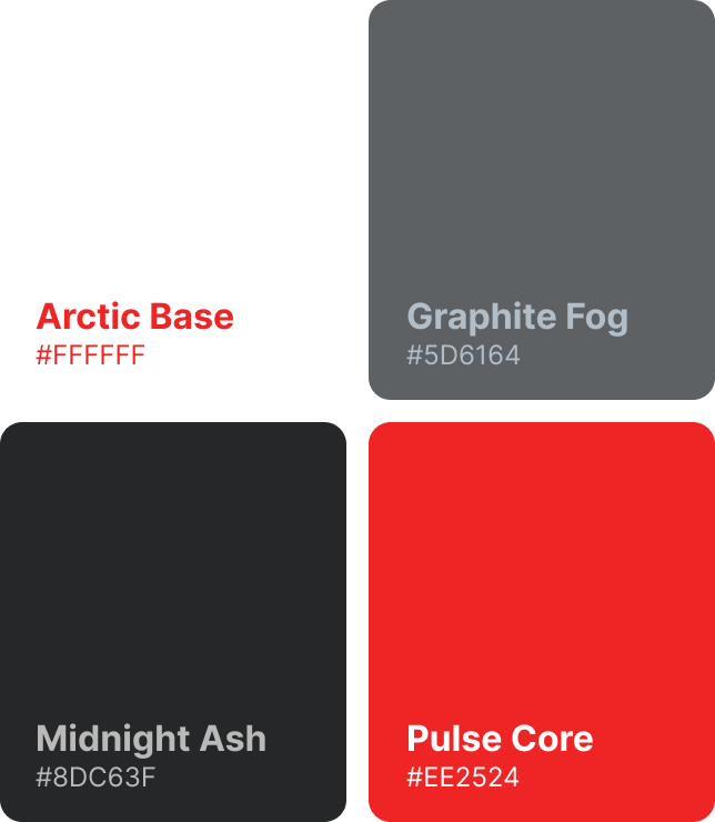
Clarity through structure
Redesigned the brand system to create clear hierarchy, legibility, and consistency across all mediums.
.png)
Cross-platform consistency
Created a unified identity that translates consistently across web, pitch decks, internal tools, and print.

Symbolic connection
The Bodhi tree mark represents growth, intelligence, and awakening — core to Bodhtree’s values.

Smart, scalable tone
Typography and color choices were selected to balance energy with trust, allowing flexibility from festival WiFi to enterprise-level deployments.
.png)
.png)

Brand in Action
The refreshed identity was applied across digital touchpoints — from product interfaces to marketing materials — ensuring it looks crisp and modern on screens of all sizes. The tree concept scales elegantly, providing a distinct yet professional visual tone.
.png)


Client feedback
I’ve never felt better - about how far our branding has come, or, where we are as a company, and you’re the reason why.

Allen Cook
Founder/CEO - TourTech Support, Inc.


The Outcome
The rebrand positioned TOURtech as a leader in high-performance connectivity, trusted by global events and enterprise clients alike. With a unified identity and bold presence, the brand now communicates speed, clarity, and professionalism across every platform — setting the foundation for future growth and innovation.
.png)


